Colors
Last updated: May 3, 2019Next to the default colors inherited from Shards, there are 3 new colors and 5 new shades of gray. All colors are available in both SCSS and JavaScript files as reusable variables and can be overwritten or extended.
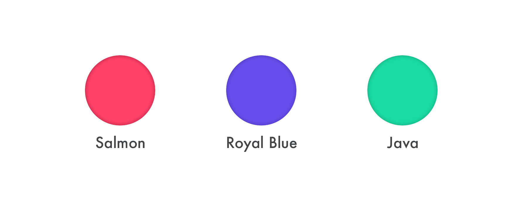
New colors
New shades of gray
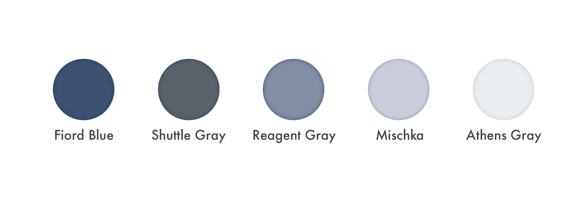
The new shades of gray are mostly used for text and more detailed shadows, while the new colors are introduced to provide more flexibility in terms of design aesthetics.
✨Tip: Not all existing components from Bootstrap 4 and Shards are updated to support the new grays modifiers (eg. buttons). The text helper classes are the only modifiers that support the new grays classes.
Accent Color
One important color variable used across the entire project in multiple places is the $accent-color (SCSS) or ShardsDashboards.colors.accent (JavaScript). You can change this variable’s value to quickly change the entire kit’s look and feel.
SCSS Colors
Please refer to the official Bootstrap 4 documentation on how to override any SCSS color. The same principle applies to Shards Dashboards.
JavaScript Colors
Overriding or extending the JavaScript colors is fairly easy and can be achieved by defining any existent or non-existent key inside the ShardsDashboards.colors object that you want to use or override. The example below shows how you can override the accent color.
<script>
  window.ShardsDashboards = {
    colors : {
      accent: '#f00' // Pure red, ew!
    }
  }
</script>
✨Tip: The color names are “camelized” behind the scene. For example a color with the name
my-colorwould then becomemyColorand can be accessed throughwindow.ShardsDashboards.colors.myColor.
Any color from the ShardsDashboards.colors object provides the following methods:
.toHex()- Returns the hexadecimal representation of a color..toRGBA( alpha: float <1> )- Returns the RGBA representation of a color. (Default alpha value: 1)