Responsive web design is not a new topic. The technology has been around even before Ethan Marcotte coined the term in 2010. It is one of the most debated topics on the web, yet, I’ve noticed designers and developers underestimate or ignore it completely when building websites.
What is the Purpose of Responsive Design?
Today we’re designing for more display sizes and resolutions than ever before. In 2016, there were more than 8 billion connected devices worldwide, a number that is growing every day. Responsive design provides a way to deal with these large varieties of displays.
Responsive design is based on three core components:
- Fluid grids that make the layout adaptable to various display sizes.
- Flexible images that scale based on their containing element.
- Media queries that allow applying CSS to specific viewport sizes or for different devices.
In this article, we’ll discuss some of the best practices and strategies that can help you design and develop responsive websites or web applications so they can adapt to any viewport size.
1. Start Thinking Responsive Early
Your team should tackle this subject in the early stages of the project you’re building. If you’ve already started prototyping or pushing pixels around without thinking about the responsiveness of the website you’re building, you are already late.
Make sure you communicate these goals to your team and explain the importance of responsive design principles from the first day. Discuss how responsive design will affect your current workflow and your project’s use cases. Clarity from the start will not only help you achieve a better execution of the project, but it will also make your life easier later when it’s usually too late to make changes.
Don’t focus only on the desktop version of your application. It’s a common bad practice to design for the desktop and then put mobile device related code under a separate URL. It doubles the effort and creates a code maintenance nightmare. Think smart and make the website or app responsive from the start to avoid code duplication.
2. Go Big and Mobile First
Devices with smaller displays are always more challenging to optimize. Due to real estate limitations, smaller mobile devices can magnify design inefficiencies. A perfect example would be a device like the Jelly smartphone featuring a 2.45” screen with 240×432 resolution. Designers and developers have to focus on the vital components to optimize such a device. It makes sense to take a mobile first approach to meet the challenge.
In a mobile first approach, designers and developers start wireframing and prototyping for the smallest device. This way, it keeps the focus on the essential features. The general principle should be the all-known phrase “less is more.” Once your team develops a robust design with the essentials in place, it’s easier to scale it up for larger devices. It improves your team’s efficiency and helps you create a better product.
3. Design for Multiple Devices
Time is always a constraint in the fast-paced world of web development. It might seem counterintuitive to waste this valuable resource to design for multiple devices. Also, recreating the same design can be boring and tedious. But the valuable practice of designing for many devices can help you save time in the long run. It will also increase the quality of your product. It’s like sharpening the ax before cutting the tree. The developers implementing the design will thank you later.
In case of a tight schedule, design at least two layouts, one for mobile phones and one for desktop devices. This method will give you the largest coverage and iron out the kinks in each displayed category. It will also help your team optimize the design for aesthetics and performance without investing too many resources.
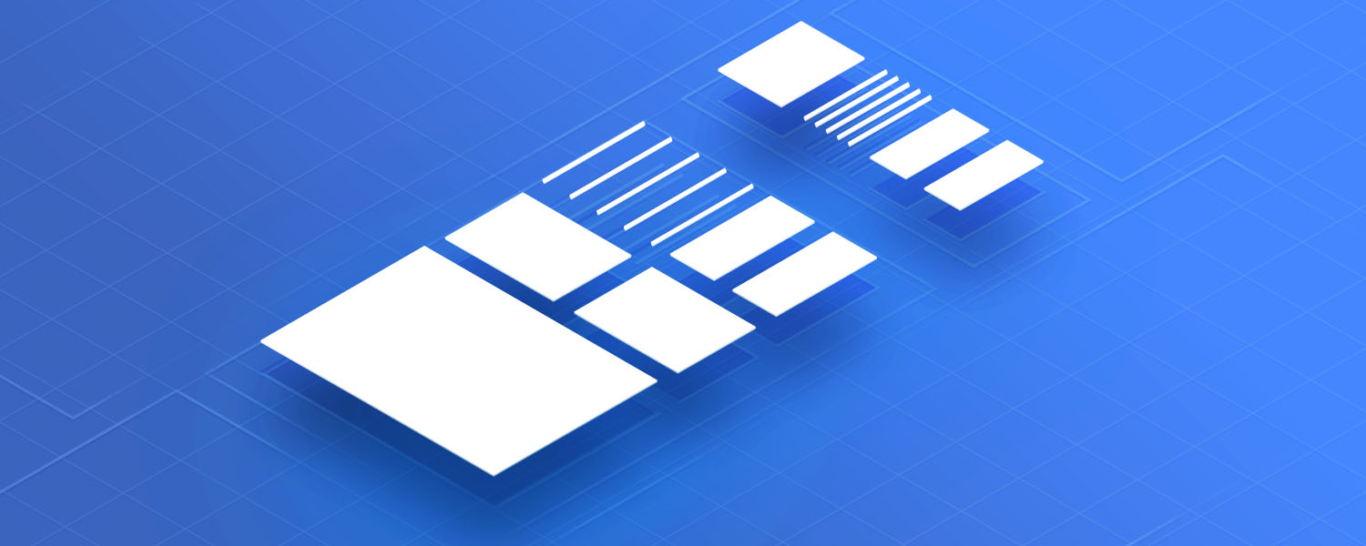
4. Use a Grid System
Put a grid system in place early. Even the initial wireframes of your interface should have the proper definitions.
Grid systems were popular even before the web as the original ideas have been developed for print. In the fundamental book Systems in Graphic Design, the famous Swiss designer Josef Müller-Brockmann mentions the importance of defining variables like formats, texts, illustrations, and typefaces at the start to figure out the grid system. These variables can significantly influence the grid layout you choose for your design.
Grids help simplify the whole design process. It helps you achieve balance and structure. When you start with a known architecture, you can then adapt and experiment with other configurations. Following the rules of a grid system allows you to design more elegant pages faster and with fewer mistakes.
5. Use Relative Units
Avoid using fixed units like “px“. Fixed units can cause maintenance problems down the road. Instead, adopt relative units like EMs or REMs to scale your CSS content.
The EM and REM units share the same core concept. The main difference is that REMs are calculated relative to the root element’s font size while EMs relative the parent’s font size. The basic formula for calculating the relative value of your pixel based value is target / context = result.
Let’s suppose you want to convert a font size of 60px to EMs:
Target = 60px Context = 16px (the default base font size for most browsers) 60 ÷ 16 = 3.75 Result = 3.75em
You can use a tool like PxToEm for easy conversions. If you are confused about relative units, make sure to check out Jeremy Church’s excellent article Confused About REM and EM?.
6. Make Media Fluid
Make sure the media content is set to be flexible and to adjust based on the parent container’s constraints while keeping the same aspect ratio. This way, browsers will resize the content appropriately if your website is also using a flexible layout.
It’s important to understand that fluidity also means giving up control. The final look might vary across various platforms. The diversity of look and feel can be both a blessing and a curse. It can be a blessing in the form of aesthetics and functionality. On the other hand, it can be challenging to track and test all the variations.
7. Follow Common Design Patterns
Patterns give you access to accumulated knowledge. They help you avoid common mistakes and develop websites faster as they are the shortcuts of web design and development. It’s worth your time to get acquainted with the most used patterns. The most popular and useful patterns worth mentioning are:
- Fluid
- Column Drop
- Layout Shifter
- Off-Canvas
Fluid patterns have a single fluid grid with vertically stacked columns. The main content maintains a fixed size with only the margins changing. In a column drop pattern, the design stacks the columns vertically when the display becomes narrow, while in a layout shifter design, the content of the layout significantly rearranges itself depending on screen size and resolution. Finally, the off-canvas pattern de-clutters the layout by taking away unnecessary parts of the web page out of the main view.
If you want to learn more about responsive web design patterns, the Responsive Web Design Patterns article by Pete LePage is a great resource to start with.
Conclusion
Creative endeavors require dedication and patience and it’s important to start from a point of knowledge. Responsive design principles provide you the necessary knowledge and information to efficiently design and develop web pages.
Thinking about responsive design from the start, taking a mobile first approach, using patterns and grids, and understanding the context of your design can help you build web pages faster. It will enhance usability while keeping the design process simple. You will be able to design and develop beautiful web sites that create a real impact on your audience.

🤔 What do you think?