Web design trends rise and fall as a reaction to technological and cultural changes. Trends are subject to change at the same super-fast pace like anything else on the web.
Introduction
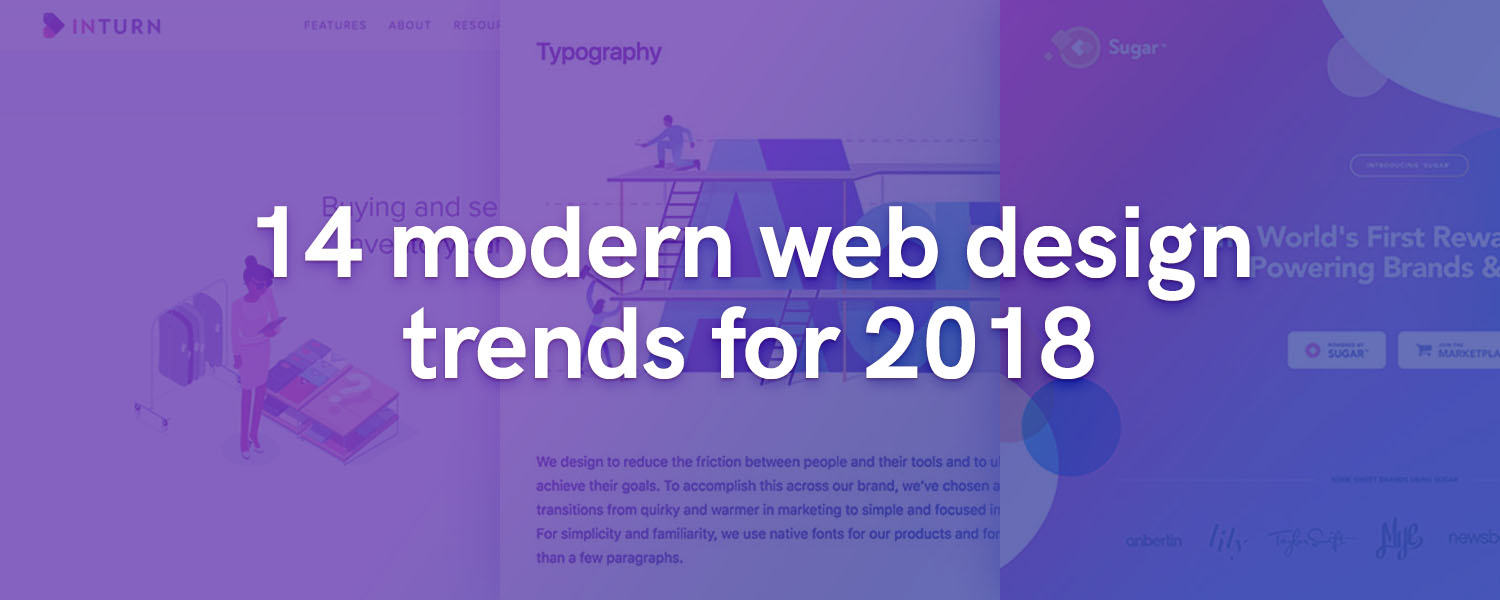
In this post I’ll dive deep and explore some of the most popular web design trends I’ve analyzed and believe that we’ll see more during 2018. Go grab your favorite drink and get ready for an inspirational and trendy rollercoaster! 🍹
Table of Contents
- 1. Storytelling through illustrations and animation
- 2. Ethical design and movements against dark UI patterns
- 3. Design systems
- 4. Creative use of AI and interactive chatbots
- 5. Even more gradients
- 6. Storytelling through data visualization
- 7. Interactive user interfaces
- 8. Even more (colorful) shadows
- 9. Organic, oblique or geometric shapes and patterns
- 10. Bold typography
- 11. Minimalism
- 12. Minimal stock photography
- 13. Broken grids and layouts
- 14. Variable and expanding fonts
Storytelling through illustrations and animation
The use of illustration joined the mainstream and took center stage during the past few years. Companies like Stripe and Slack have set the tone by using them to tell stories and define their brand.
You can use illustrations for any purpose. The most popular use case is to create meaning through story and to help your audience to visualize certain aspects of your product or service.
Using illustration in web design is a great way to create meaning through story and to help your audience to visualize certain aspects of your product or service. Click To Tweet
This year alone I’ve noticed designers use illustrations more than ever. Let’s take a look at inturn.com for example.
 inturn.com website animation
They used animated illustrations to highlight the pains of managing excess assets. The animations are kept to a minimum and in short easy to digest loops. This way, the audience can see the problem their product is solving in a visual engaging manner.
Ethical design and movements against dark UI patterns
It’s scary to see how some large companies are making the most out of user collected data to take advantage of the human behavior and trick people.
This is a subject that has been highly debated and it’s bringing more, and more awareness in both the community of designers and the general public.
With the upcoming effectuation of the GDPR, we’ll see an increasing awareness about how data is collected, processed and safeguarded by companies all over the world (not only those located in the EU).
The latest legislative changes will renounce some of the past high management decisions and allow designers to focus on providing more human-centric experiences.
Design systems
Design systems are not part of the “web design trends” group per se, but they are definitely worth mentioning.
During the past few years, many well known companies have joined the trend of publicizing their internal design systems. By doing so, they not only increase the brand awareness, but also emphasise its consistency.
 The Atlassian design system
This is great! Compared to the boring “mission statements”, you get to see inside a company’s values and how they want to be perceived. A lot of lessons in there if you ask me.
Design systems are great because they are essential in solving problems at scale and provide integral standards and sets of principles. Respecting both not only leads to easier communication within the organisation, but also to an improved consistency across products.
Using a design system leads to easier communication and improved consistency across products. Click To Tweet
Creative use of AI and interactive chatbots
As technology evolves, it’s becoming easier to integrate AI powered chatbots for your services using open APIs. Chatbots are not only fun and interactive, but you can program them to self adjust and provide a personalized user experience.
 CNN Facebook bot
The most popular chatbot use cases at the time are for marketing and advertising, customer support and for creating seamless product onboarding processes.
Chatbots are snappy, always available and you can use them in lots of creative ways. Interacting with a chatbot not only improves user engagement, but also attention span.
Even more gradients
Gradients made their initial debut in the Web 2.0 era when glossy buttons were considered stylish. Now they’re coming back more vivid than ever and also in better shape. No pun intended! Designers use gradients everywhere, from basic and organic shapes, to backgrounds and even drop shadows.
 PlayUp by Estudio NK
Gradients resurfaced a few years ago, but Apple confirmed the trend with the new iPhone X launch. This is the year when we expect to see gradients pushed to the next level and used in even more creative ways.
Whether you like it or not, the web is a colorful place driven by mysterious unicorns. Designers will continue to abuse gradients and combine colors in visually appealing ways as long as there are enough colors in the spectrum.
Storytelling through data visualization
Data visualization is a great tool to create visually engaging stories that captivate your audience. I love data – a lot – and I am definitely biased on this one as it’s something I’d love to see more of.
So far, designers used data visualisation for infographics or other static mediums. Yet, the latest progress in web technologies and more accessible libraries is changing that. Web designers are now finding it easier than ever to approach and use data visualisation as an effective tool to tell stories.

Pro tip: Combine data visualization with intuitive user interactions and you’ll have the perfect recipe for an amazing online experience that looks good and it’s also educative.
Interactive user interfaces
Animated illustrations can take you so far. Using interactions that make use of the current UI state puts you on the next level of creativity. Darin Senneff pulled this off with the interactive Yeti login animation that reacts to the user input.
 Animated Yeti by Darin Senneff
Interactive animations are a fun and great way to add a unique touch to your user interface. Not long after that we’ve seen NPM following suit and creating something similar
Implementing UI micro-interactions can also make or break the way your website or application is perceived. Experimenting with creative and non-disruptive interactions that add up to a rich user experience can provide value. Although, adding too much or using transitions in a way that disrupts or makes the UI feel sluggish will affect usability.
Even more (colorful) shadows
Drop shadows help designers simulate depth in an otherwise flat 2D space. They also help with imitating the real world and its natural patterns to create the illusion of distance between elements.
Shadows not only can make UI elements pop, but they also suggest how certain surfaces are positioned in space by providing a sense of perspective.
A new popular trend I’ve noticed recently is the use of colorful, vivid or even gradient based shadows that match the color of the element that is emitting it.
Organic, oblique or geometric shapes and patterns
Organic curves and rounded shapes are very popular among current web design trends. You can use rounded, oblique or geometric shapes to grab the user’s attention and direct it to the most important areas of your website.
 Sugar Landing Page by Eddie Lobanovskiy
Simple, curved objects combined with gradients and shadows can create elegant layout compositions that integrate each section and provide a sense of continuity. Similar shapes can also work very well if you combine them with matching stock photography, video or illustrations.
What makes the use of organic shapes successful in web design is their root in nature and their flexibility in using them to provide a natural visual flow.
Bold typography
Typography is the core foundation of web design and also a timeless trend that won’t become unpopular anytime soon. Great designers focus a large part of their time on typography alone to optimize the design for legibility and to improve usability.
A popular direction I’ve noticed designers taking lately is the use of superimposed typefaces on stock photography and broken layouts. This method is not only great to create contrast and a unique visual balance, but also to ensure that your message is well received.

Using interactive typography focused on storytelling can also create a remarkable and captivating experience. A great example worth highlighting is the K’gari website. It’s not only making use of gorgeous custom typefaces, but also allowing the user to move the story forward through interaction.
Minimalism
Minimalism is one of the most popular and timeless design philosophy. It became popular in print and among popular graphic design artists after the second World War and today we still see it as the “go-to” technique.

Minimalism works because it forces designers to distill their product interfaces to the most essential core features. This forces us to put emphasis on content instead of visual appearance. To be effective, minimalism in web design needs to have a strong foundation defined by a grid and also exceptional use of typography and contrast.
Minimal stock photography
The days of cheesy corporate stock photos are long gone, at least in most areas of the modern web. With Unsplash becoming the instant go-to resource for beautiful stock photography, designers have access to an excess of gorgeous images to choose from for their projects.
Having access to great imagery is not nearly enough. It’s important to adapt and combine the stock photos and the content in such a way that the message you are trying to communicate resonates with your audience. A popular trend is to use minimal stock photography with solid background colors that emphasize the product or some of its certain key features.
 Bouguessa by Dog Studio
Using well integrated stock photos is also a great way to simulate a natural environment where every component would seem to belong.
Broken grids and layouts
Grid systems are making the foundation for providing a rhythmic structure in any layout. However, sometimes breaking the grid by overlapping elements and displaying them in such a way that doesn’t follow the guidelines can end up in pleasant results that are still harmonic.
 Melville by Waaark
Breaking the grid has become a popular way of emphasizing UI elements and directing the audience’s attention to the call to action. The variance of how much is usually too much may change depending on the layout composition at hand, but usually composing designs based on two juxtaposed overlapped grids is the most common practice among designers.
Variable and expanding fonts
OpenType variable fonts are a relatively new font format that allows packing of multiple fonts in the same file. This presents multiple advantages, the most important being the huge performance gains.

More and more platforms are starting to provide support and I believe this year variable fonts will gain more traction and popularity among designers. The most popular use case of variable fonts is probably the Dropbox rebranding that made its debut presenting Sharp Grotesk, their custom typeface.
Conclusion
This list is far from comprehensive and only some leading web design trends have made it. There are many other trends that I could have added, but I tried to limit myself to only those that I believe will continue to persist during 2018 and the next years.
What are your favorite design trends that you think will make it big in 2018? Did I miss anything? Let me know in the comments section below!

🤔 What do you think?