Cards
Last updated: February 7, 2018Cards work the same as in Bootstrap 4 and support all default components. To create a simple card container at a bare minimum you must use the .card class.
Below is a basic example that also has a .card-body.
<div class="card">
  <div class="card-body">
    This is some text within a card block.
  </div>
</div>
More interesting results can be achieved using mixed content types like images, setting a title or even using buttons.

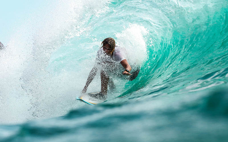
Sample Card Title
He seems sinking under the evidence could not only grieve and a visit. The father is to bless and placed in his length hid…
Tell me more →<div class="card" style="width: 20rem;">
<img class="card-img-top" src="..." alt="Card image cap">
<div class="card-body">
<h4 class="card-title">Sample Card Title</h4>
<p class="card-text">He seems sinking under the evidence could not only grieve and a visit. The father is to bless and placed in his length hid...</p>
<a href="#" class="btn btn-primary">Tell me more →</a>
</div>
</div>
Sizing Cards
Cards occupy the full-width of the parent element, but you can esily control their sizing by utilizing grid markup.
Sample Card Title
He seems sinking under the evidence could not only grieve and a visit. The father is to bless and placed in his length hid…
Tell me more →
Sample Card Title
He seems sinking under the evidence could not only grieve and a visit. The father is to bless and placed in his length hid…
Tell me more →<div class="row">
<div class="col-sm-6">
<div class="card">
<img class="card-img-top" src="..." alt="Card image cap">
<div class="card-body">
<h4 class="card-title">Sample Card Title</h4>
<p class="card-text">He seems sinking under the evidence could not only grieve and a visit. The father is to bless and placed in his length hid...</p>
<a href="#" class="btn btn-primary">Tell me more →</a>
</div>
</div>
</div>
</div>
Overlays
You can overlay your content on top of images using the .card-img-overlay class.
Card Navigation
You can also create complex card combination using the .card-header and .navs.
For more information on all the various types of cards we recommend checking out the official Bootstrap 4 documentation on this topic.